
So Summer skies are finally gracing the English shores after a hiatus that seems to have lasted forever, instantly giving my the urge to excavate the freezer of my massive American fridge freezer in order to find my ‘go to’ edible coolant of choice…. Ben & Jerry’s Chocolate Fudge Brownie ice cream, I rummage through the kids Yollies, Ice Pops, Fabs, Del Monte orange juice lollies and the Mini Praline Magnums that I ration, grab the B&J’s tub, but something just doesn’t feel right, it feels…..EMPTY!!!!!…AAAARRRGGGHHHH!!!!
Wait, something glistens at me, the ice crystals sparkling…I reach in and grab it, take a look, it’s something that looks familiar, and yet it’s not something I’ve seen before…a bit like a pair of Yeezy’s posted on Instagram in a colour wave that you’ve never seen before, hinting at being an imitation Chinese knock off, but you just can’t prove it…what was it you ask? A Cornetto….kind’ve…but it just didn’t look the same!
So, as you may’ve guessed I’m a bit partial to an ice cream and generally I instantly know which one I like the look of and which one I don’t. When it came to Wall’s latest rebrand, I wasn’t quite sure; in all honesty it didn’t take away from the taste but I thought I would break it down a bit further to see exactly where I stood with its aesthetic appeal.
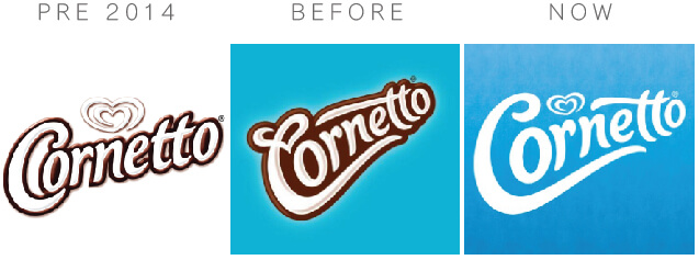
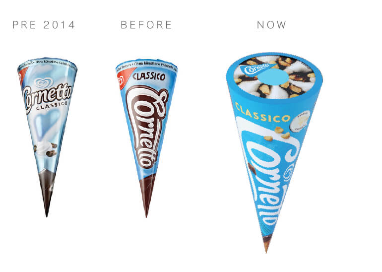
So Wall’s redesigned the Cornetto brand back in 2014, improving on it’s dated, almost 1980’s typography and subtle (read as washed out) Wall’s logomark with an impressive amalgamation of the lettermark and the Wall’s ‘heart’ logomark. I was really impressed with the way the heart had been melded to the ligature of the Cornetto ‘C’ (from a design perspective I thought this was brilliance at work), the Italian gelato seller feel of the type and the fluffy, creamy flow of the lettering that still appealed to my inner child.
Now, in 2018, Wall’s have gone a step further to making the Cornetto logo more modern, and in their own words, ‘…younger and fresher..” Well, yep, it does look fresher and cleaner and I like that! The simplification and removal of texture shadow and the heaver outline has definitely worked and given it a modern feel and allows the branding to work on any background colour; incidently, Wall’s have also added a new accent colour palette for each flavour in the range as part of the rebrand. The Wall’s ‘heart’ has reappeared as the crowning glory of the logo as it does on other Wall’s product lines such as Magnum, Vienetta, Carte D’or and Twister, whilst I would’ve preferred them not to do this and stick with the combined heart and ‘C’, I can appreciate the overarching brand discipline that Wall’s is trying to establish amongst it’s child product lines.
All in all the rebrand works, adding more sophistication, possibly more appeal to cappucinno and flat white drinking university students and 20 somethings, rather than children and teens that so much more of its other product offering can target more effectively – Well done Wall’s and Design Bridge for the redesign.
Would I reach for it over a Praline Magnum…probably not! Enjoy the Sun 😀