

Firstly, Happy New Year! Wishing you all health, wealth and happiness in 2017.
I’ve been meaning to start a design related blog for a while but was always a little in awe of the many talented creatives out there doing an amazing job passing on little doggie biscuits of knowledge to all the hungry design hounds out there. Then I thought, hey, I agree with most of what they are saying…but that’s not MY voice, that’s not what MY eyes see, hell, that dude’s not half as funny as me etc etc…so here it is…my first blog. I’m no authority but hopefully someday I will be, these are my thoughts, my experiences and little golden nuggets of brand building wisdom that I’ve learnt along the way, that will hopefully assist in your quest to build your brand, and therefore your business….and at the same time I’ll help you look as sexy as possible! What’s not to like?!
Without further ado, here it is…my very first blog. I hope you make it to the end! 😉
So, you’ve sat there, you’ve pondered incessantly whilst driving to your next meeting, “…Should I change my company logo and branding?…”
In most cases this is something that is often put on the back burner. After all, why should you change something that’s worked for you for so long? Why should you spend money on something that is doing it’s job, none of your existing customers have ever complained have they?
Well that’s just it, branding doesn’t affect your ‘existing’ customers – it affects potential new customers that don’t see your brand conveying the same core beliefs that their company stands for or not having the desired forward visions as a partner company that they wish to pursue; it all makes a difference in the long run. This is new business that you are missing out on, not to mention any recommendations that transpire on the back of this!
As an example you can look at new tech startups like app developers who won’t go anywhere near partner companies that still use dated 80’s graphics in their branding – even if it is just an accountancy firm which you’d expect to be boring! Boring however is a different kettle of fish to professional looking, which you would expect an accountancy firm to be; should a company. at the forefront of what it is doing, have a visually unappealing logo? I myself had a choice of video production partners to choose from, most of which all had almost identical production techniques and I connected to the styling used by all firms when filming; not that it was a factor but they all also weighed in at around the same price. The time had come to choose one and I chose the one that used branding that I found:
- was the most pleasing – indicating an adherence to design elements and keeping up with current trends.
- fitted with my own brand identity – and therefore hopefully also aligned with my own vision.
- was current and didn’t feel dated – reflecting a similar mentality with the people I was dealing with.
I went with this company and have enjoyed a wonderful working partnership since! We always see eye to eye on the direction of videos and I seems relatively easy in getting my points across and seeing them transition across to film.
So, in my personal opinion, and I wouldn’t be in this job if I thought otherwise, the evolution of branding is very important. Below are two examples of companies that have had a recent makeover, both of which I love! I’ve chosen these particular logos as they are not drastic overhauls of the look of the brand but are subtle changes that refresh the company’s image keeping them current in the eyes of today’s consumer market, whilst at the same time maintaining their heritage, identity and intrinsic DNA.
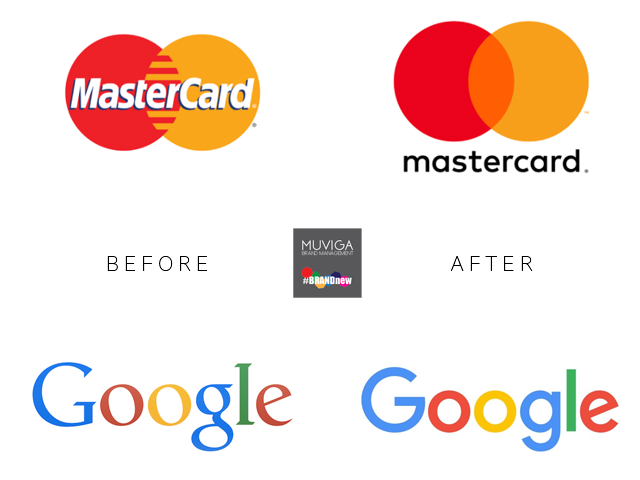
As you can see, in the first example, the newer Mastercard logo is a lot cleaner and it doesn’t look like a throwback from the early 90’s. This is down to losing the stripes where the orange and red circles overlap and replacing them with a colour blend of the two base colours of the circles.
The newer logo has moved the wording from the centre of the logo to below the logo, making the actual graphic of the circles more prominent, I think that this makes it even more iconic and, over time this will become more synonymous, people will automatically relate this to the Mastercard brand even when the lettering is not present – a great move in my opinion as in some instances they may want to simplify the branding even further down to the two circles, for example small items such as pens or pencils or items where there needs to be a bit more discretion such as computer security keycards issued to employees.
The actual typeface used in the Mastercard wording has also changed to a much cleaner, more modern looking font, as well as dropping the uppercase ‘M’ and ‘C’ (I actually don’t like the fact that the old logo uses a capitalised ‘C’ whilst the name doesn’t and the newer one is entirely lowercase – the wording in the logo should reflect the the case used in the company name in my opinion).
Al in all, the newer logo is a lot cleaner, the change of font makes it look a lot more modern, but the iconic overlapping circles remain, meaning the logo maintains its tradition and heritage whilst appealing to a newer, younger generation. This hopefully means they will catch the eye of this newer demographic and hopefully attract a newer generation of consumer and gain a lifetime of loyalty.
In the second example of Google, a brand that doesn’t need any real promotion, the subtle change of font used, in my personal option, has worked miracles in refreshing the brand identity of this digital giant. The colours in the logo remain the same with a slight tonal difference in the green and blue used. I’m very glad that the first ‘G’ remains uppercase. The original calligraphic font has been replaced with a sans serif typeface specially created for Google.
I believe google stated the reason for the change was that they wanted a logo that worked across a multitude of devices from desktop screens to smartwatches. This definitely seems to have done the trick. The cleaner lines just work….. and that’s about it! All in all I think that by losing the old fashioned typeface, the newer logo maintains the heritage of the Google brand whilst gaining the street credibility worthiness of Generation Y and beyond. It tells the consumer that ‘this IS the future – we are the future – stick with us’
So, as a conclusion, well in my opinion at least, I believe a brand refresh can only benefit your business and help you to increase your customer appeal, which ultimately means growing you customer base.
What do you think?