

Welcome to a ‘#BRANDnew Week’ people! So, after an amazing response to my first blog, as I have now committed myself to posting interesting articles at the beginning of each week (well on both parts, that’s actually all dependent on how wide awake I am on a Monday morning!), I’ve also decided to rebrand the blog; infusing the Muviga #BRANDnew strapline – hopefully that will mean we all get the week off to a flying start…
So here I am sitting in my studio/office/junkyard, thinking about when it’s going to be time to take my next dose of painkillers for excruciating back pain, thoughts of other things that cause me pain flutter in and out of my head… having to miss playing sports due to injury… clearing up post house party avec hangover…having an uber driver not turn up when desperate to get home when a ‘quick drink after work’ has turned into 03:30 in the morning…but what I find most mega migraine inducing of all; BAD LOGOS!!!!!
One of the logos that I look at and have that WTF moment is Costco’s own brand ‘Kirkland Signature’. I remember this being the branding since Costco has been in the UK so it’s probably been in use in the US since Costco’s inception. This has obviously become ingrained as the signature of Costco but in my opinion it has become seriously dated, it looks very crude and although it stands out on the product, there is no actual flow between the Kirkland branding and the actual product branding. Now there’s only one real reason Costco haven’t spent any effort on changing this; they want to appear as no-nonsense, it definitely adheres to the ‘cost cutting’ philosophy BUT it remains looking like it was created in the 80’s and assumes the customer doesn’t care what the branding looks like as long as the price is cheap.
As a result of my contempt for this monstrosity, I have deconstructed the Kirkland Signature logo and attempted to update it and make it #BRANDnew, making it adaptable for a full range of different types of product, whilst still maintaining it’s core DNA. These are the things that I have tried to change:
- Updating the Kirkland typeface, which I believe utilises the Franklin Gothic Heavy font, to use something slightly less blockly which is cleaner looking.
- Update the typeface used in the work Signature to be something that is less reminiscent of an 80’s movie poster.
- Lose the harshness of the black rectangle background of the logo.
- And generally make the logo more visually pleasing whilst not losing the Kirkland Signature identity.
Here is my favourite new design shown next to the original logo:
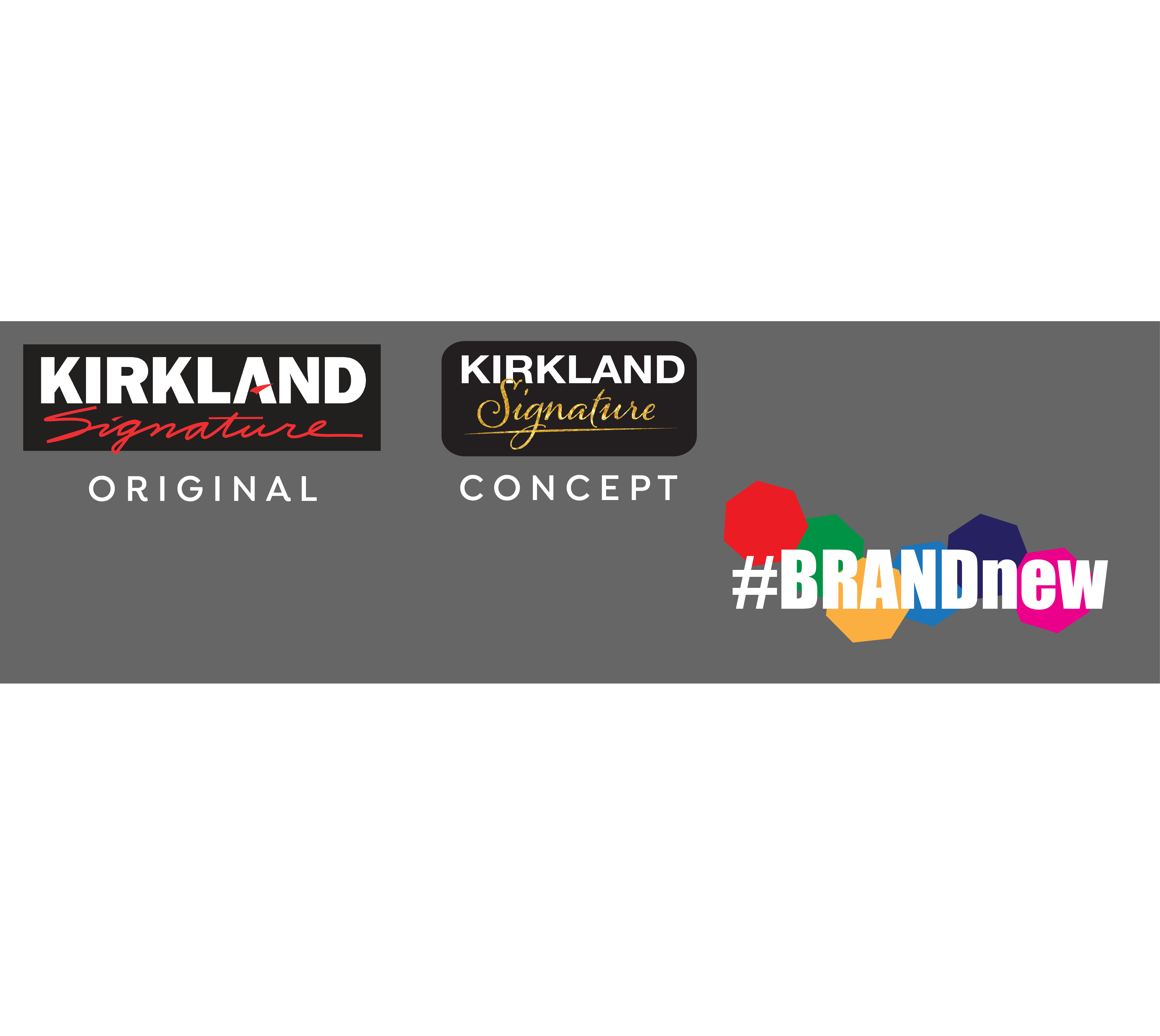
I think the ‘favourite’ concept looks a lot more streamlined, the new ‘Kirkland’ typeface is a lot cleaner and looks far more modern but maintains it’s roots. The font used in the word ‘Signature’ now looks more elegant and classy which is also emphasised by the use of the colour gold in the wording indicating luxury. The curvature in the lettering helps the branding remain friendly looking which is also highlighted by the change of the black background rectangle to one with rounded corners.
Let me know what you think.
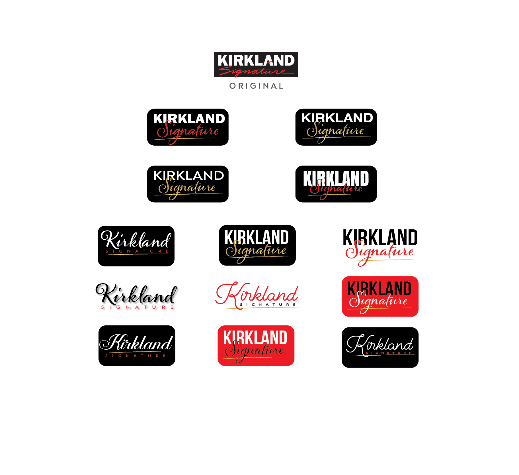
My full range of concept logos are below, please note that these are initial concepts that have been quickly created and would obviously need to go through several rounds of revisions before being presented to a client if this were a live project. The original logo is shown and the top.
Are there any logos that generally p*** you off? Let me know and I will attempt to reconstruct them via the contact form. On the flipside, please get in touch for quotes if your company or product is in need of a brand refresh!
Same time, same place next week for a #BRANDnew Week!…. Now, where are those painkillers????